
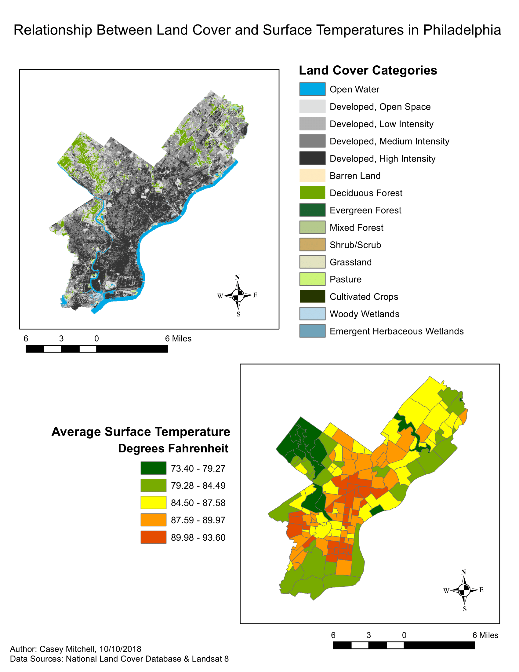
About: I created this infographic via ArcMap in my 2018 Environmental GIS course in order to compare surface temperature and land cover across the city of Philadelphia.
Data: Satellite imagery downloaded from Landsat 8 on July 30, 2017, 2011 landcover data downloaded from the National Land Cover data website, and a shapefile of neighborhoods in Philadelphia downloaded from OpenDataPhilly.com.