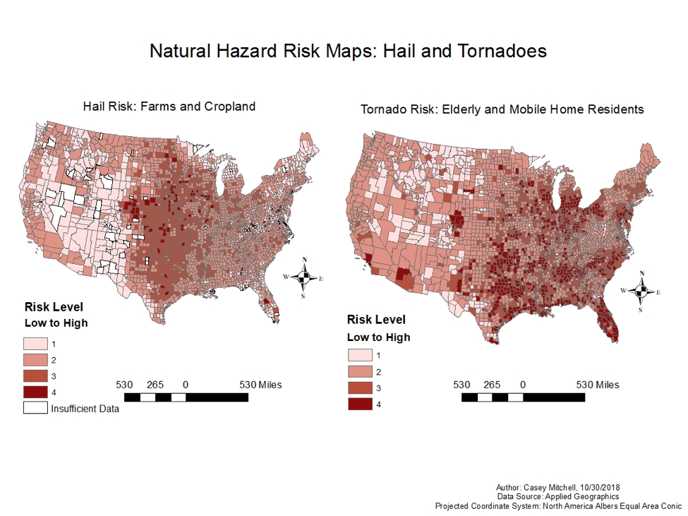
About: I used ArcMap to create two choropleth maps displaying natural hazard vulnerability indexes in my 2019 Environmental GIS course. Each map factors one natural hazard (hail/tornado) and two social variables (quantity of farms and cropland/ elderly population and number of mobile home residents) into its vulnerability index.
Methods: I joined the natural hazards attribute table data (weather data) to the counties shapefile. I then used the quantile classification approach to divide each vulnerability index factor into four classes, i.e. the quartile of counties with the least number of tornadoes was assigned a 1, the next quartile was assigned a 2, etc. and the country with the most tornadoes was assigned a 4. The quartile of counties with the least number of elderly residents was assigned a 1, and so on, for all vulnerability factors for both maps. I then weighted each of the factors and created a composite index by adding all of the weighted scores for each of the counties via the field calculator. The darkest counties represent the most “vulnerable” according to the weighted variables.